Feb 2022 — Aug 2024
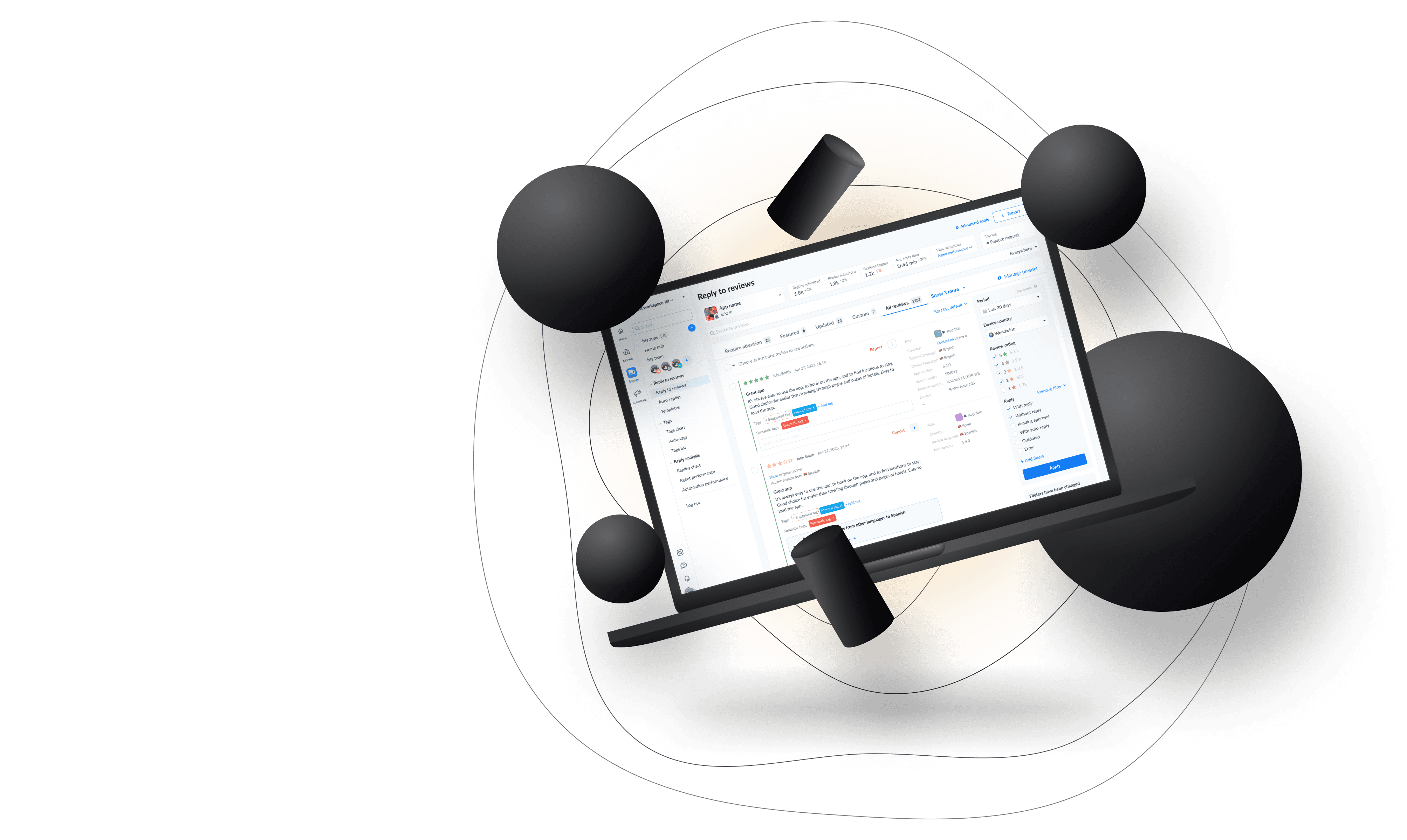
App management platform for tracking and optimizing app reviews, performance analytics, and competitor insights across app stores, streamlining feedback analysis and market trends.
Achievements
Iniciated using ux researches,
established design processes,
participated in 2 projects awarded on the internal hackathon.
Key projects
User onboarding,
navigation,
subscription page,
dark mode
I was a designer in the Growth Team, handling subscriptions, billing, and revenue. I also improve user sign-ups, onboarding, and product tours, blending tech skills with business goals to boost growth and user satisfaction.
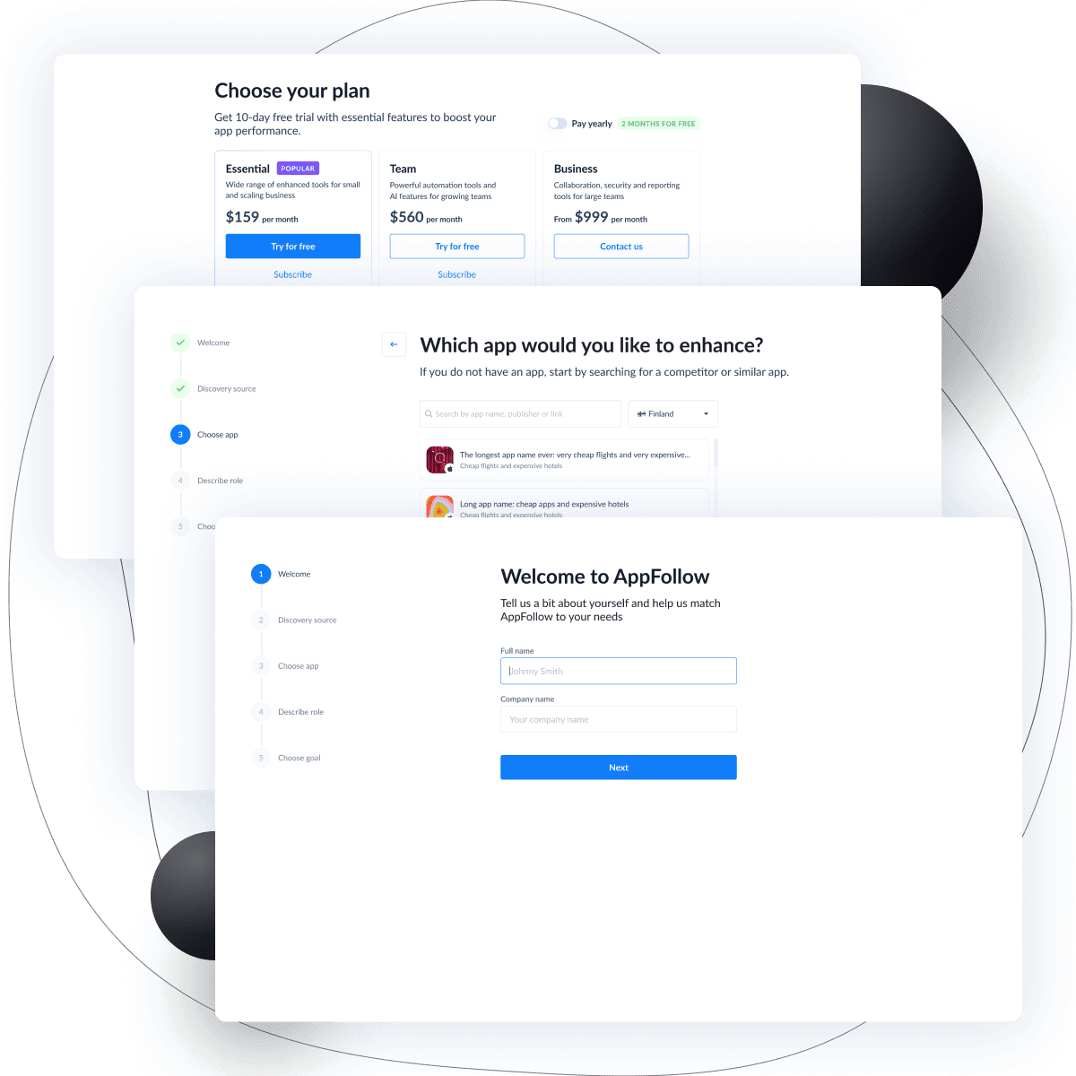
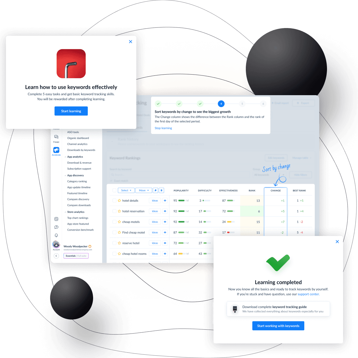
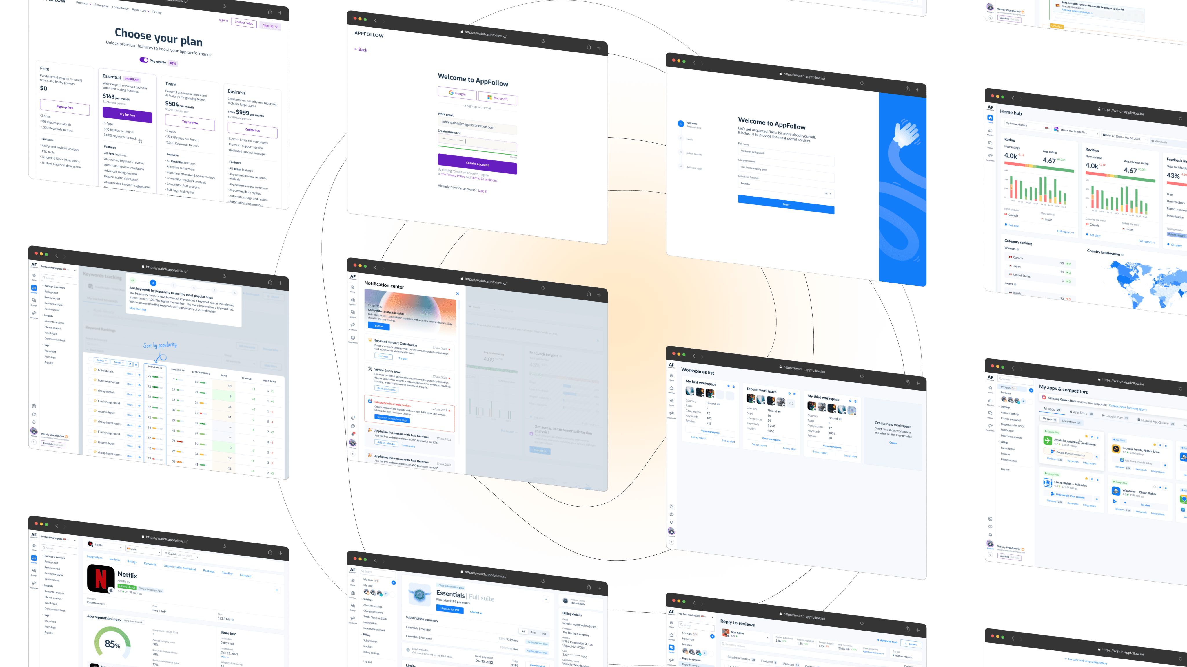
The project includes work on sign up, account setup and product tours. I've started with the research, simplified the flows and made it more clear for users. Now there's a stage of experiments and tweaks to make it work good both for users and for business. Main goals of all the changes is to grow conversion to paid & grow retention.
Sign up
I've simplified sign up flow and added Google and Microsoft sign up options, which affected on conversion to sign up. The next step is to fix an old strange mistake and move sign up flow from the website to the product. In design it will affect only styles.
Account setup
Account setup, previously boring technical page, turned into a completely new flow where we gather a lot of info about user to make the further experience smoother. By adding trial suggestion to this flow, we've significantly raised amount of trials activation.
Product tour
The new version is in development now.
For the initial version, we aligned with the new pricing model, introducing three products, each offering three plans. However, the company later opted to simplify this structure to just three straightforward plans. Before beginning the project, my research indicated the subscription page lacked clarity and information. The business objective for this page focused on promoting upgrades and add-ons. The final design strives to balance user and business needs effectively.
Free plan
I've added limits visualization which should affect on amount of upgrades. Limits is the only dynamic part of the subscription which change while our client uses the product.
That's the reason why we don't show all the features here: they cannot be changed and can be found on the website. We had a lot of hot discussions if we need features here.
But what's really important is to have the certain place in the product where user can choose one of our plans and upgrade his subscription. And where we can promote our sales, discounts and additional services, of course.
Paid & trial
For the paid plan, we have absolutely different priorities. User can find how much and for what services he or she pays. The user also can find his billing info and easily buy more limits if runs out of them.
I spearheaded the redesign of the product's navigation system to enhance user experience and streamline access to key features. This involved analyzing user feedback and behavior data to identify pain points within the existing navigation. By reorganizing the navigation structure and introducing intuitive elements, we achieved a more user-friendly interface that significantly improved navigation efficiency and overall user satisfaction.
Main problem
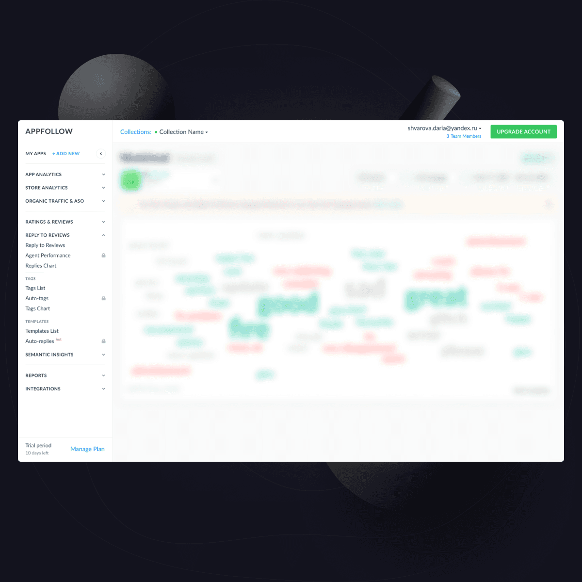
AppFollow has grown into a complex, ever-evolving product boasting numerous features. However, its navigation patterns and menu structure have remained unchanged since its inception as a modest service with just a few pages. Over the years, as new functionalities were added, the menu expanded significantly and became overwhelming. This complexity has led users to randomly click through various menu sections in search of the information they need.
Iteration 1
Over 80% of users adopted this version at the soft launch, praising its simplicity and clarity.
Here's the menu as of April 2024, after several minor adjustments.
Iteration 2
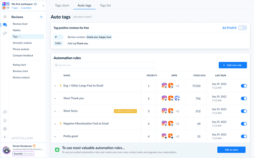
After receiving user feedback and testing the new version of the menu we noticed several areas of improvements. This version is on the stage of usability tests in April, 2024.
In this version, we made workspace select more informative, and collapsed the pages with related functionality into one page with several tabs. Our next step will be simplifying usability and getting rid of these tabs where it's possible.
